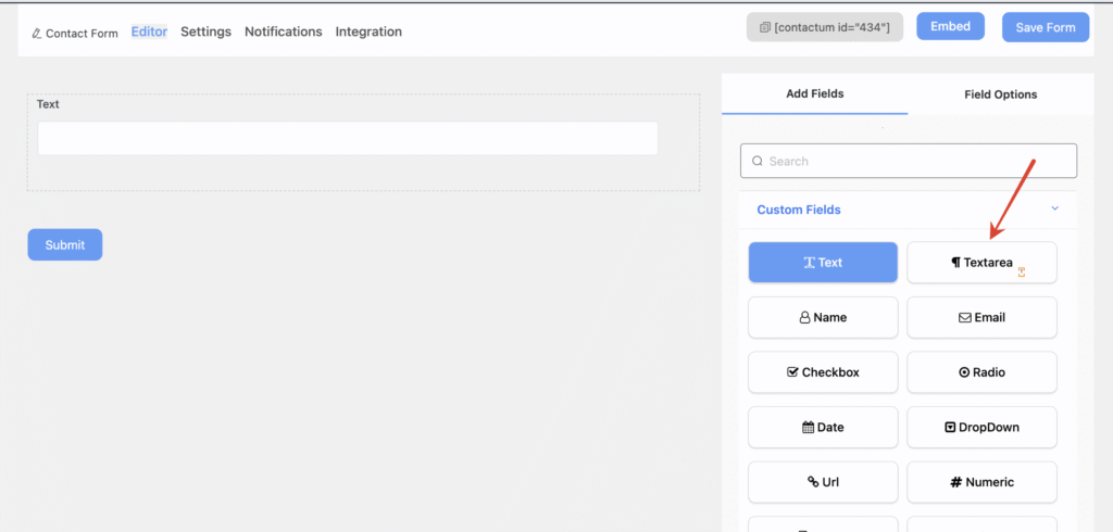
Using the Text Area field in Contactum allows users to enter and submit multiple lines of text through your WordPress contact forms. To add this field to your form, navigate to the Add Field section. From there, you can either click on the Text Area field or drag and drop it into the form builder.
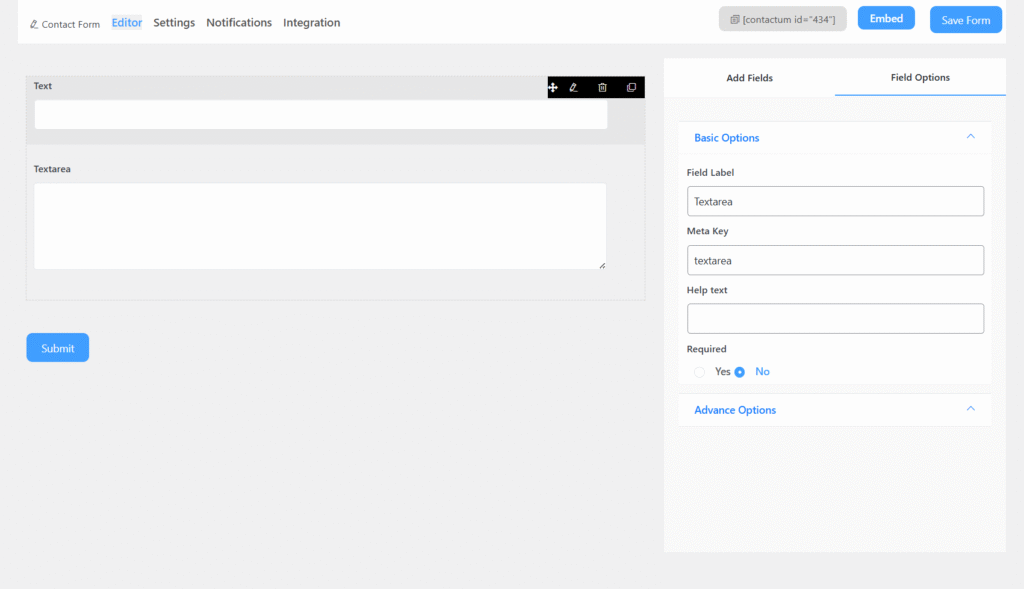
Textarea Field includes the following options:
- Field Label: Defines the purpose of the field.
- Meta Key: Automatically created when you edit the label, but it can still be modified manually.
- Help Text: Provides guidance on what the user should enter in the field.
- Required: Specifies whether the field is mandatory or optional. If enabled, an asterisk (*) will appear next to the field label.
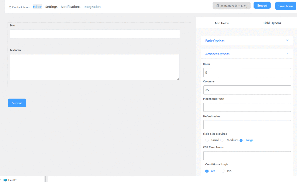
Advanced Options
You can access the advanced options located just below the “Required” setting of the Textarea Field.
The advanced options include:
- Placeholder Text: Appears inside the field as a hint or example. It disappears once the user starts typing.
- Default Value: Displays pre-filled text in the field. Unlike placeholder text, this remains visible even when the user enters additional input.
- Size: Adjusts the field’s dimensions by increasing or decreasing its unit size.
- CSS Class Name: Allows you to assign a custom CSS class for styling the field.
- Rows: Specifies the visible height (rows) of textarea
- Columns : width (columns) of the textarea.