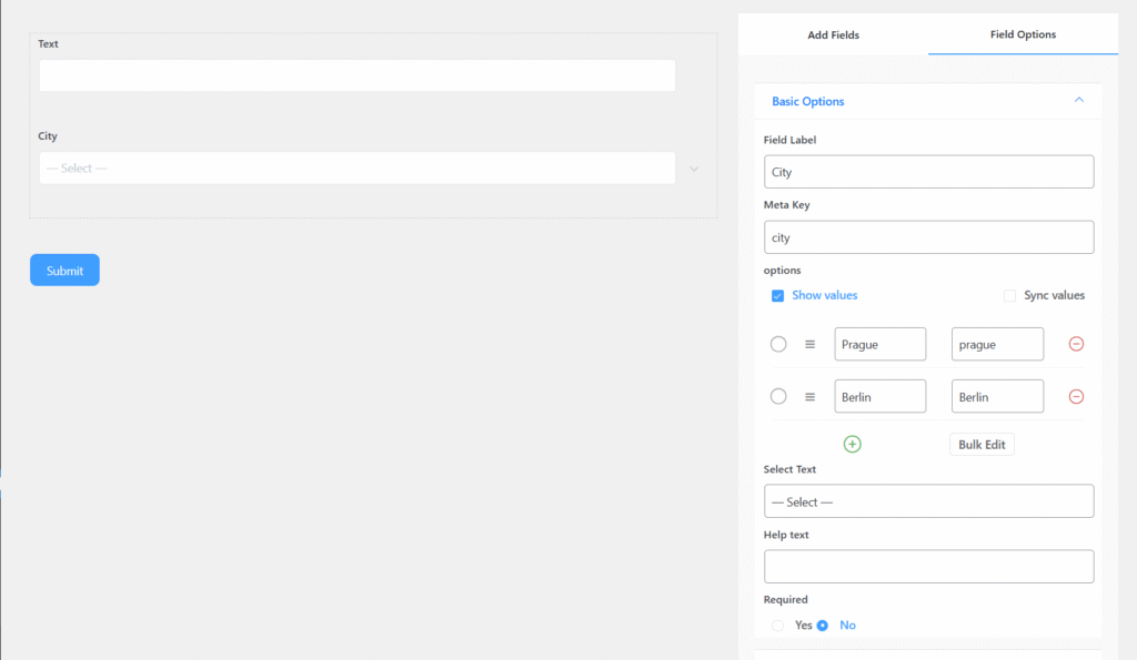
Dropdown Field includes the following options:
- Field Label: Defines the purpose of the field.
- Meta Key: Automatically created when you edit the label, but it can still be modified manually.
- Options: Use this setting to add items that users can select
- Select Text: Customizable text that works like a placeholder inside the dropdown field.
- Help Text: Provides guidance on what the user should enter in the field.
- Required: Specifies whether the field is mandatory or optional. If enabled, an asterisk (*) will appear next to the field label.
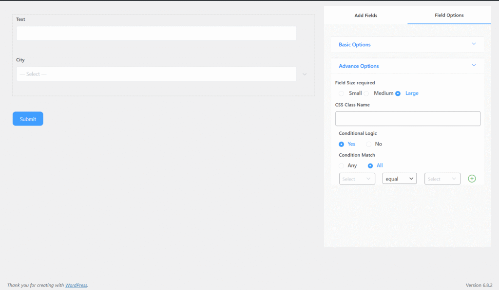
Advanced Options
You can access the advanced options located just below the “Required” setting of the Checkbox Field.
The advanced options include:
- Size: Adjusts the field’s dimensions by increasing or decreasing its unit size.
- CSS Class Name: Allows you to assign a custom CSS class for styling the field.